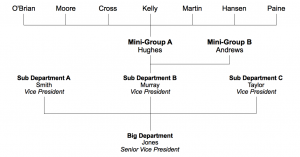
The traditional top-down org chart has become so standard in today’s corporate America that the first time I posted my alternate version for our team, very few people understood it.
Let me describe it for a moment.
In this sample chart (nearby), let’s look at Hughes and her team. All the people she supports are listed across the top (O’Brian, Moore, Cross, etc.). They’re across the top because they’re the ones who get stuff done. They’re assigned to projects, they complete the work, they keep the company running.
Hughes is placed under them, not in a position of submission or inferiority, but of support. Their location above Hughes should remind her that she is to do what’s needed to keep her people effective and efficient in pursuing the group’s goals and objectives. Just about whatever it takes. Sometimes that’s called servant leadership, itself a radical idea in much of today’s culture.
And likewise, Murray’s location under Hughes reminds him to support her in achieving the department’s goals.
This doesn’t change HR and doesn’t impact how performance reviews occur. (Maybe it should?) It’s not even very efficient in getting the most number of employees organized on a single sheet of paper. But it does get across the message that it’s the employees who matter and it reminds us just who we’re supporting.
Readers, what do you think? Would changing how you represent your organization change how you think about your department? Would it change your leadership style? Comment here or privately to JeffreyGifford (at) gmail (dot) com.


nice information, thanks. hope you add some more posts soon.